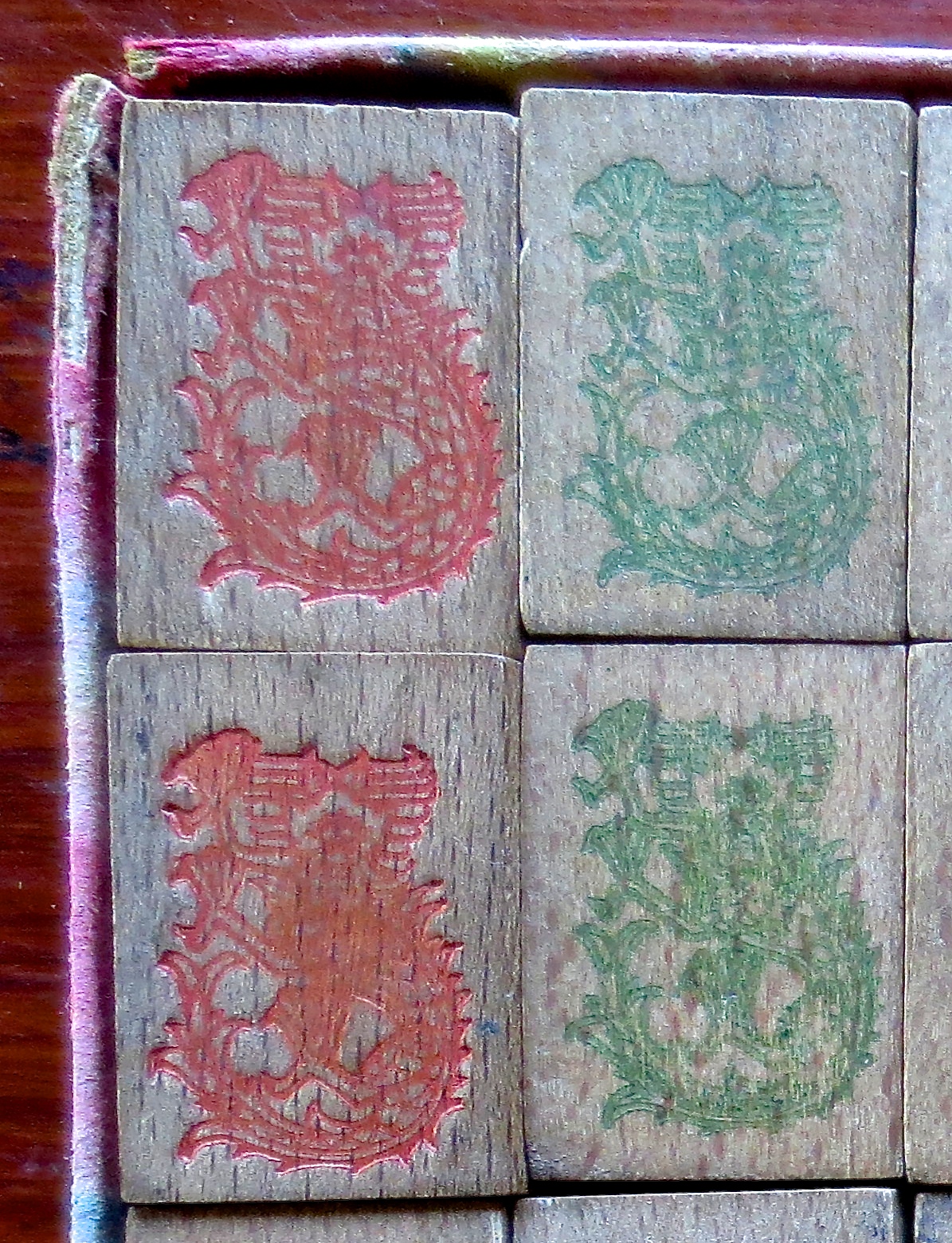
From time to time we come across a set with great history. The other day I met a lovely lady named Mim whose family has owned this F. Ad. Richter set ever since they lived in Europe in the 1920s. Mim played with this set when she was a little girl, and when she moved into a retirement community a few years ago, she brought this set with her. The set has been a treasured possession for her for about 90 years. The pieces are still in the original cardboard box, four big "drawers" for the suits, Honors and Flowers, with the counters in smaller boxes forming the bottom layer. And many wonderful memories are associated with this box of 144 special tiles.
Richter was a manufacturer in Germany in those early days, and its designs are sophisticated and unusual, even in this simple wooden set. There is a special look to their images, all quite different from what we normally see. It seems the designers were given artistic freedom, and all suits, but especially the Craks and Bams, have their own style. Even the letters and numbers have their own look, inspired by German lettering. Interestingly, even though Joseph Babcock gets credit for marketing the game in the 1920s, Richter was involved with the game years before. The story about Babcock is that he learned the game in 1917, but according to CHarli, Richter sent someone to China in 1916, during the First World War, to study the game, and the company started making sets soon thereafter, probably the first one to make them for international sale.
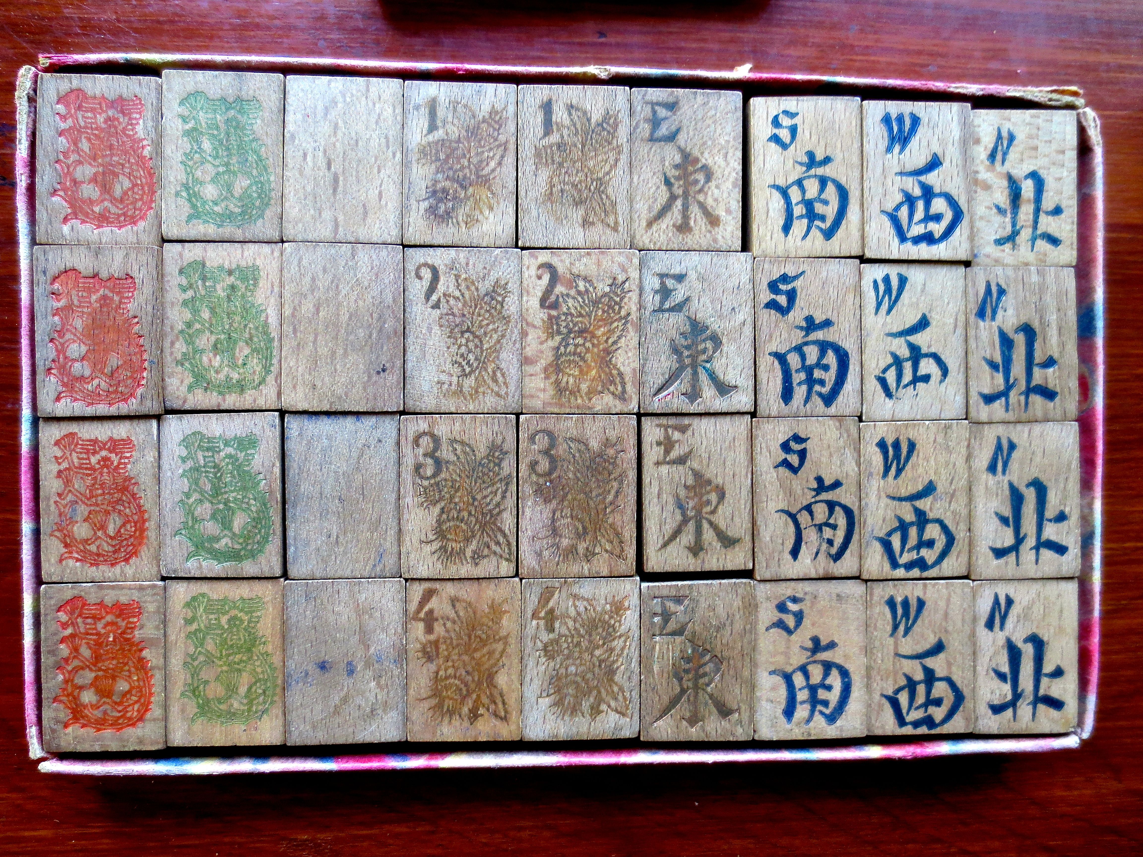
As you can see here, there is a great deal of flair, even in the Winds which are quite unique in their appearance. There is a real Germanic look to the letters. The Red and Green Dragons face forward, looking directly at the viewer.
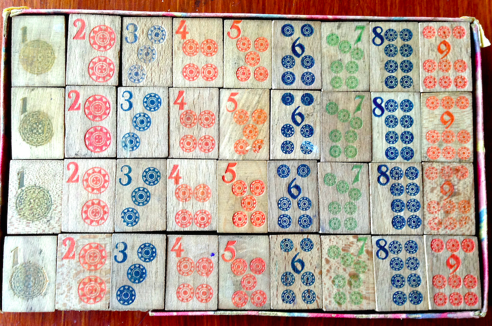
The Dots have a very detailed One Dot, evolving into simpler designs, but still featuring the numbers with that same Germanic style.
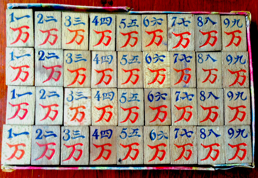
The Craks almost seem to leap out of the drawer!
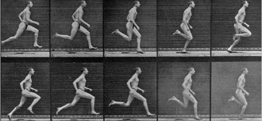
To me, they resemble these photos by Eadward Muybridge from the late 1800s.
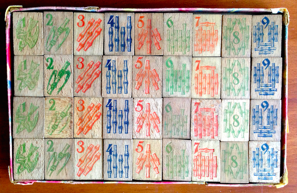
But look at these designs! The Bams are fabulous. Note how the diagonal of the One Bam bird almost "morphs" into the 2 Bam bamboo shoot and into the 3 Bam. Notice how the 8 Bams altho they do look a bit like other 8 Bams, actually have four vertical stalks, two long and two short, and four short diagonals. The 5 Bams and 9 Bams are real standouts.
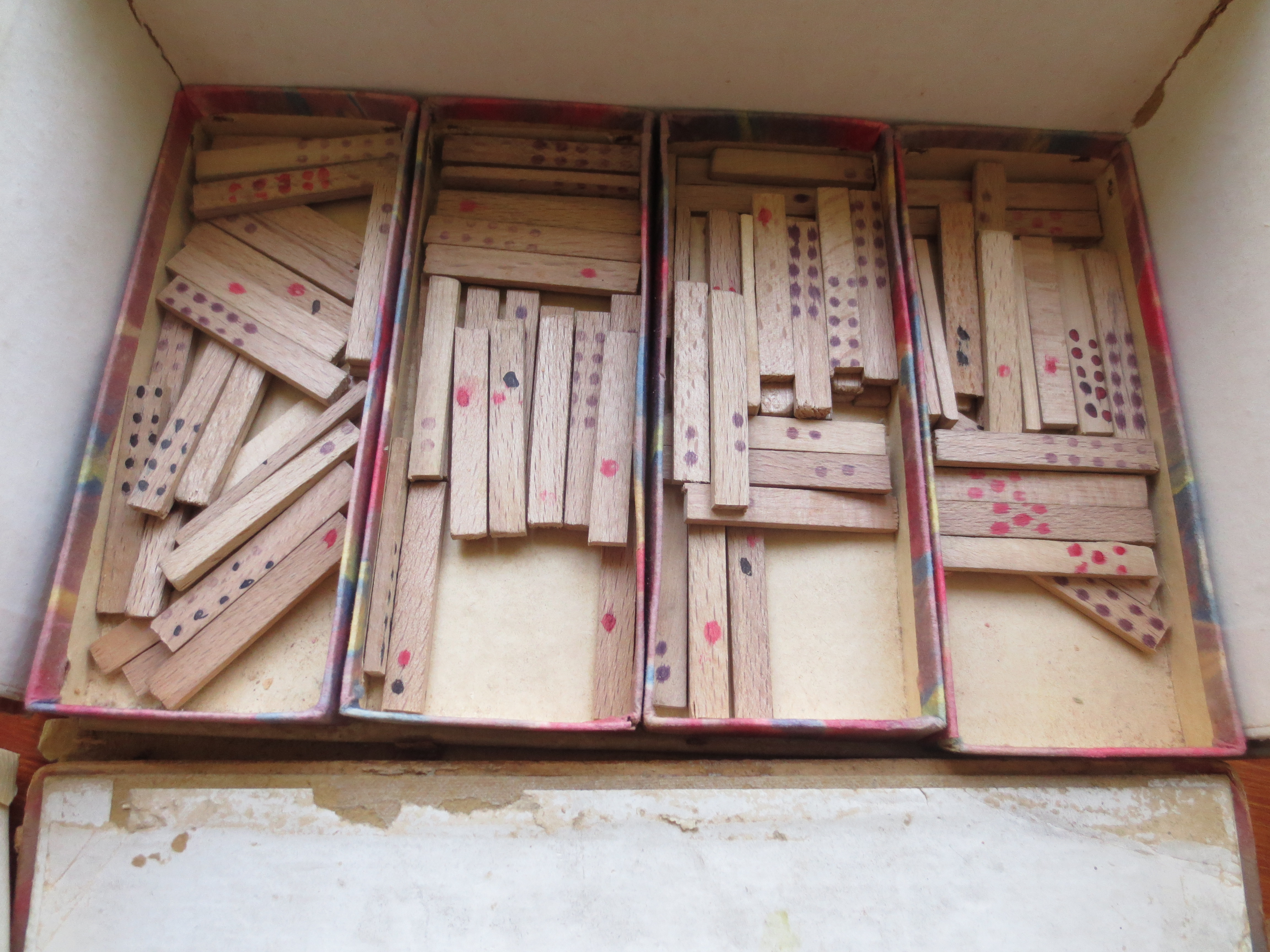
The last drawers that contain the wooden counters
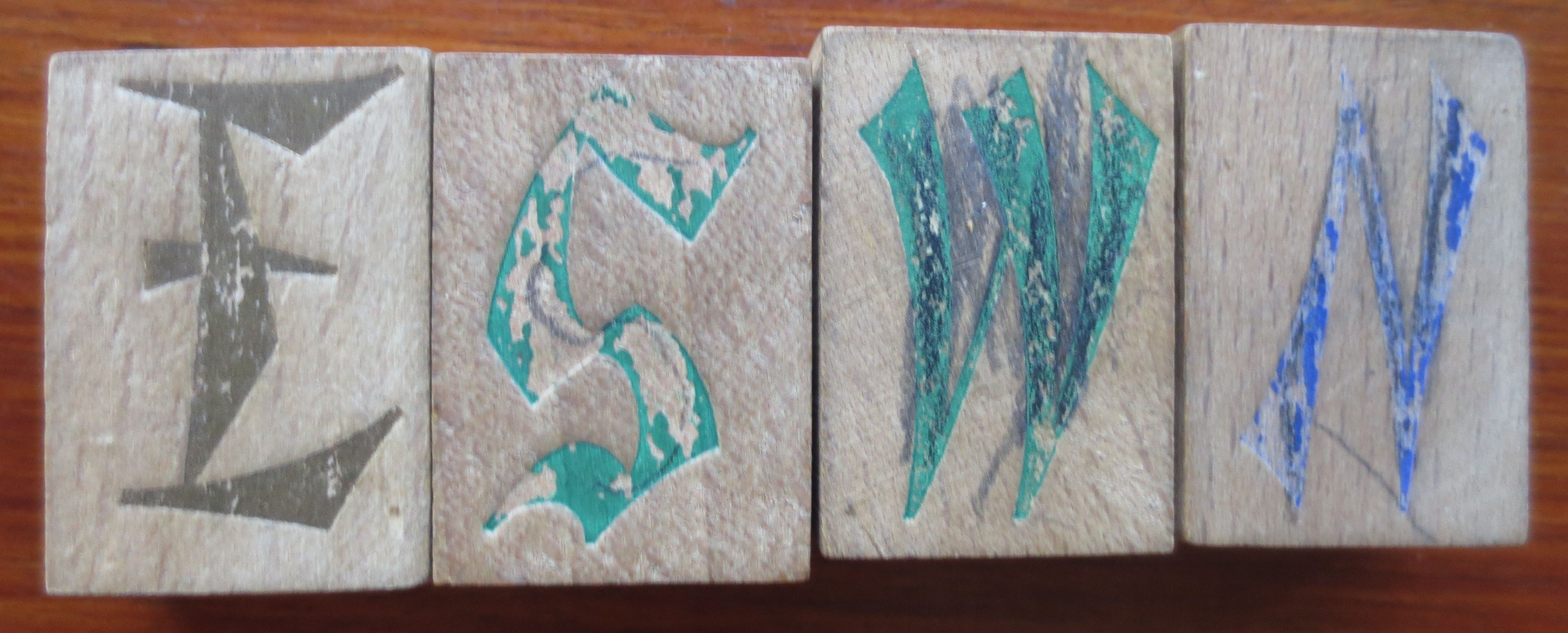 and the Wind indicators, (apologies in this photograph the S is upside down).
I asked a graphic designer to tell us about the typeface used. I thought it was quite unusual, and this is what he said:
"The typography or “typeface” of the numerals on the Dots and Dragons of this set by Richter are noteworthy. While the lower numbers and the 8 are what is called a basic “Gothic style,” the “6”, “7” and “9” are in a distinctive calligraphic font which was very popular in Germany in the 20’s and 30’s called Fraktur. Basically, think of The New York Times or the German newspaper Frankfurter Allgemeine Zeitung for the City of Frankfort which is still in circulation—their banners are in this font. See the example below.
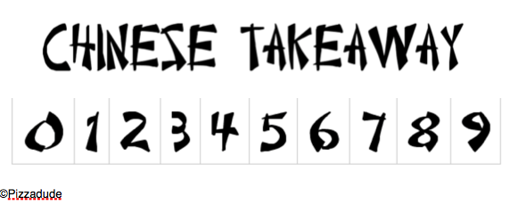
Fraktur fell out of favor in Germany bigtime after WWII but what is so delightful, it’s calligraphic numerals look somewhat “Chinese,” and ultimately they would evolve into what I call a variation of the ubiquitous “Chop Suey Fonts” used on countless Chinese Restaurant signs and menus to this day. Indeed, check out Pizzadude’s Chinese Takeaway, a contemporary “ethnic” font used now.
Germany, was barred by the 1918 Versaillles Treaty from trade with China (indeed Britain and France stripped all of Germany’s Chinese Colonies and gave them to Japan—whether or not that was a good thing is for historians to debate). At any rate, could it be that the Germans, who were not allowed access to the flood of imported Chinese Mah Jong sets in Europe, were then forced to come up with their own inventive designs for this game, sui generis? Without making too much about it, I think this is the case. Certainly one could argue no one came up with more smartly designed tiles and boxes than the Germans did in the twenties and early 30’s—whether or not their sets were made of Mother-Of Pearl, bone or of "stone" by Richter.
The numerals on this charming German wooden set can be seen as a small but further example of the flowering of German ingenuity regarding Mah Jong. It’s an almost “transitional” set to the Western Market. The Mah-JonggTM Sales Company, and their desire for continuity and control of the market had little tolerance for delightful quirkiness such as this. The exotic-pseudo yet very endearing “Chinese” font of this German set would have no place in Mr. Babcock’s world. "
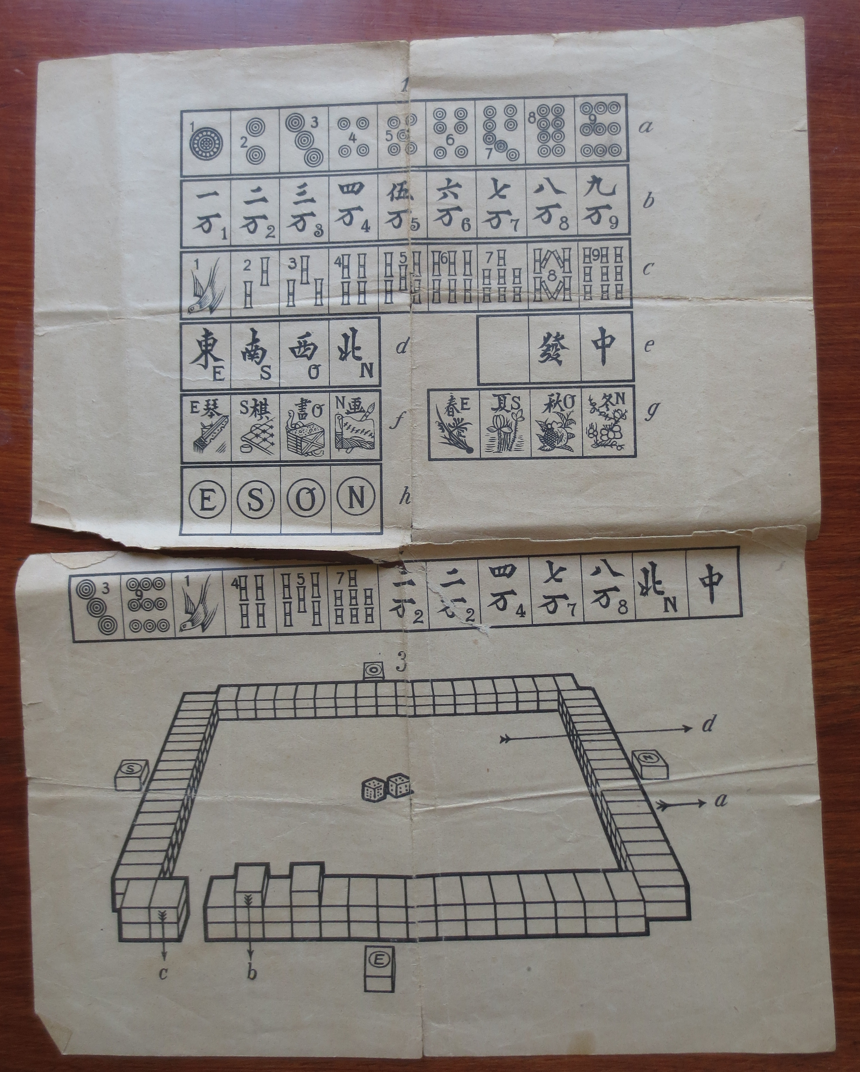
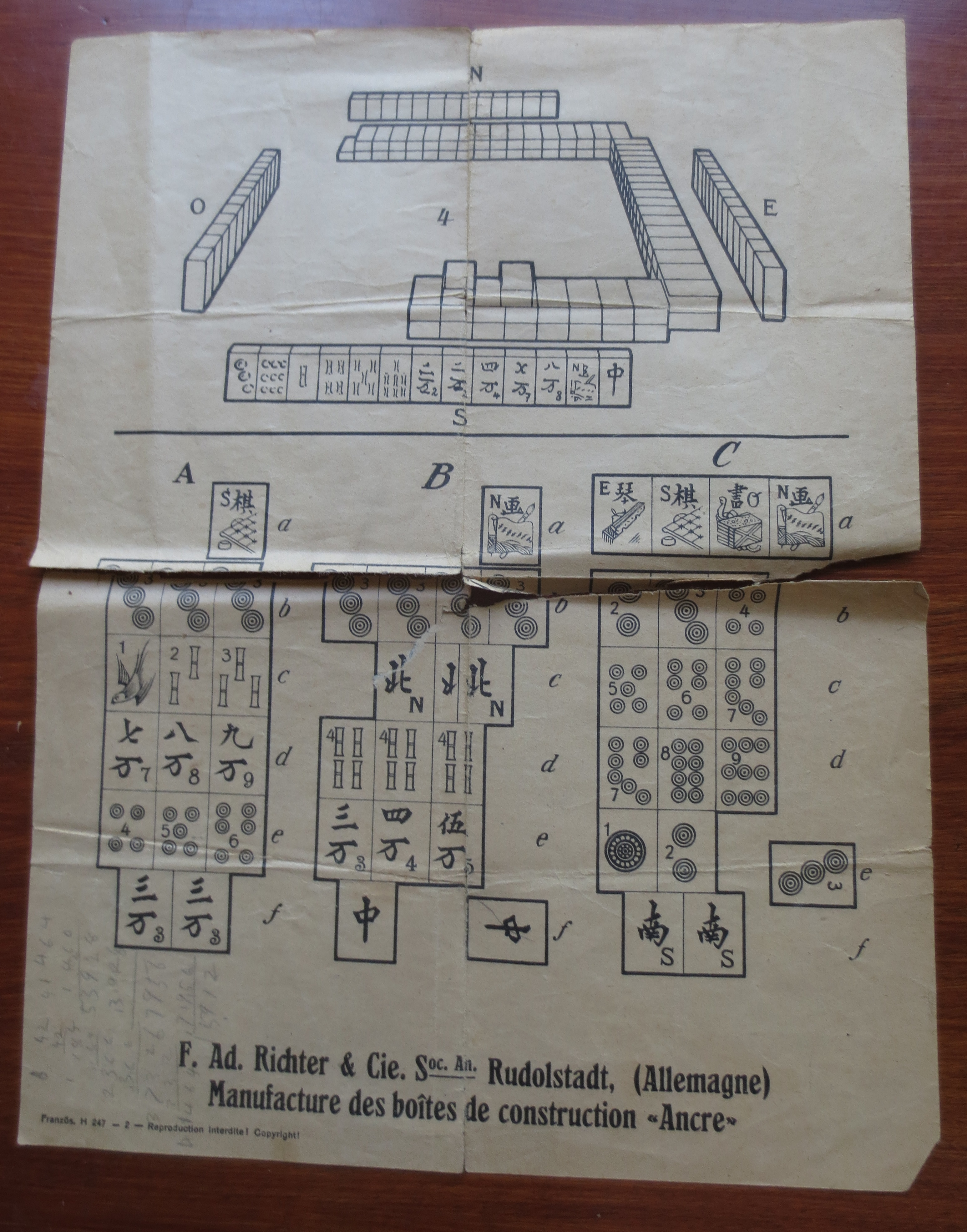
The set came with the original paperwork
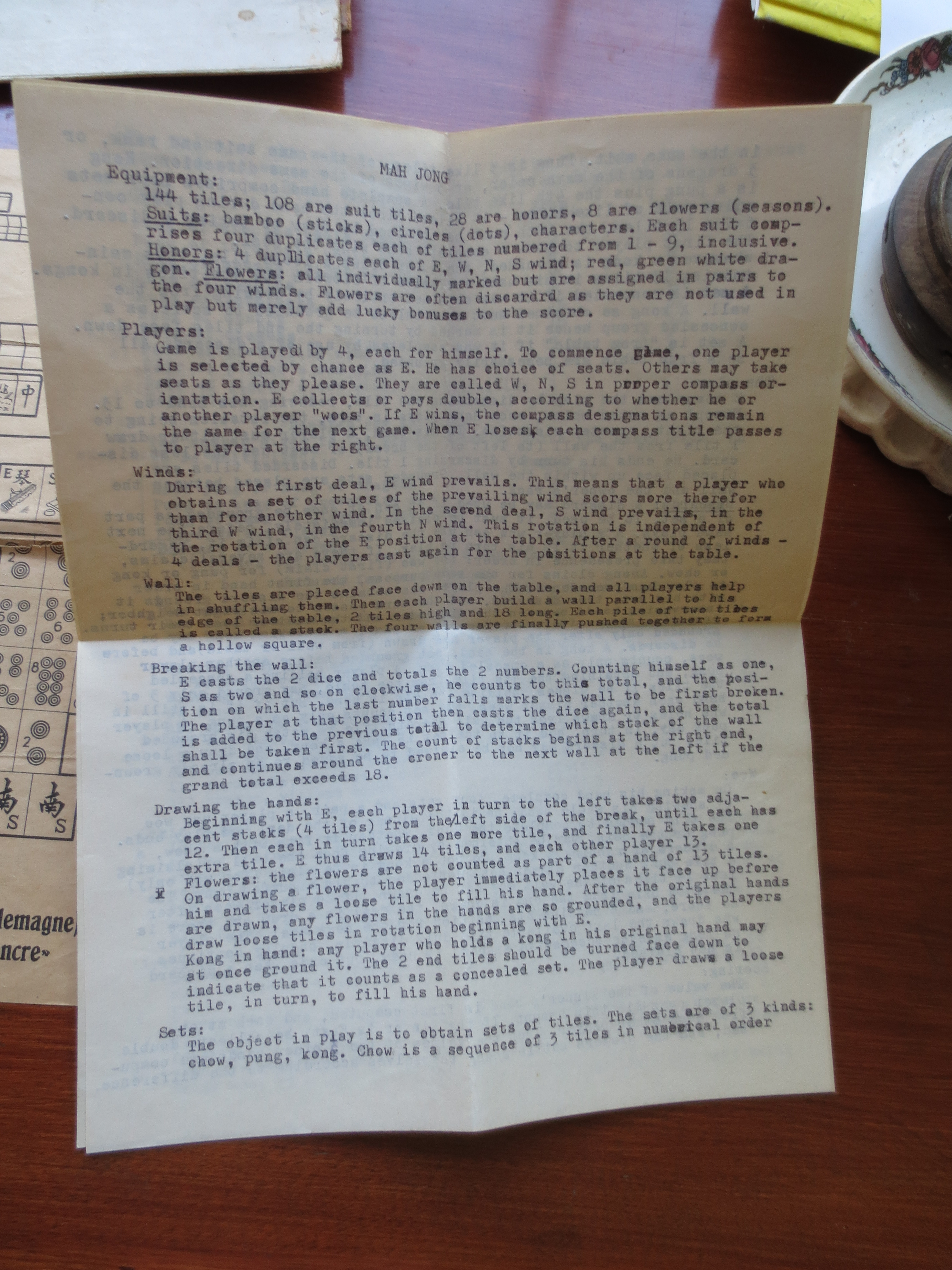 and the old typed instructions from the 1920s that were added to make scoring and playing easier.
Many thanks to Mim for sharing this Mahjong Treasure with us all.

